Thursday, 1 February 2018

Caribbean Colours


In September of last year, hurricanes Irma and Maria wreaked havoc across the Caribbean – affecting thousands and destroying homes, workplaces and communities. The Caribbean in particular is a vibrant area that I like to call my second home and seeing the devastation was heart wrenching. 


It is at this time of year that we would normally consider going to visit, to break up the bleak winter days. With all the pictures of the overturned homes and streets cluttered with debris, you might not realize just how alive the island was, so I've dug into the archives to offer a look into the vibrant life that was on the British Virgin Islands before disaster struck.


Being there, its hard not to catch island colour fever. I really admire the use of such strikingly rich colour in such inconspicuous places. We the North don’t really seize the opportunities to brighten up our lives in little ways as the Caribbeans do. Experimenting with a little color never hurts and could be the right medicine we need for Spring renos!


Thursday, 14 September 2017

Words to motivate the Workout


Whether running for an extra five minutes, pushing for one more set or holding that plank for just a little longer, a motivational mantra will go a long way. 

In both spaces the client simply wanted some fresh paint, but I decided to go the extra mile with the design, without flexing too hard on the budget. I chose to rep bold colours and use cut vinyl to empower and inspire. I wasn't able to change the room layout or the flooring but I did get some choice phrases from my favourite personal trainer. 

In one I chose a bright and energizing orange along the bulkhead that crosses the large room and repeated the colour with the vinyl phrases on the walls. The other space is smaller but looks out onto the lake so I was inspired to reflect the blue hues onto an accent wall. The other walls are either all mirrored or glass which allow you take in the view. 

All in all I'd say I raised the bar with this quick and artistic way of putting the fun into fitness!


Tuesday, 28 February 2017

Lakefront Social Room is back in Action

On a beautiful property right on the water in Burlington, two sister buildings had dated amenity spaces in need of renovations. 

The intention was to transform the dated social room - not only used for social events, but also as an exercise spot. This meant that the space had to have the flexibility of creating an open area in a pinch. I got rid of the clunky counter and cabinets in the centre of the room and instead provided a long counter running along the perimeter of two walls.

To completely transform the space, I touched every surface; removing carpet and installing porcelain wood tiles, changed out the wallcoverings, redesigned the kitchen with built-in appliances and conveniences, and introduced a new lighting plan. And of course the furnishings had to be easily movable to make the space adaptable. I installed a 15 foot bench along one wall so seating would be out of the way, but always near by.

I love the artwork in this reno - I have been waiting to use these glass pieces, and found that the nature-inspired pieces reflect the serene location of the property. The striking, yet in-expensive, piece over the sink is a compliment to the room and also serves to hide the electrical panel. The artwork adds just a hint of colour and vibrancy to the neutral space.

before
Up next, we're transforming the billiard room ...stay tuned!


Friday, 26 August 2016

Washed-out to WOW!


For three laundry rooms in residential buildings mid-town and downtown, it was time to give a fresh look to the washed out spaces.

A laundry room, often overlooked despite it being a vital amenity seen by nearly all the residents, can say a lot about the building itself in terms of visual appeal, accommodation, and more importantly, functionality.

In most buildings the laundry room is more often in a dingy space in an obsolete corner, installed with the mindset for mere practicality. With this in mind, my goal was to change this focus so that residents would be able to enjoy their laundering experience in a comfortable and warm environment.

The plan for the two mid-town sister buildings was to freshen up their closed and stark-white industrial look with neutral colours. We started renovations by knocking down the dividing walls within the laundry room to open up the space. With the additional space, we were able to install large tables in the centre of the room where tenants could fold clothes.
before - Downtown 

Similarly, the building downtown followed suit with the founding neutral palette; we switched out the out-dated chicklet flooring for long wood grain tiles that continued up a feature wall. But of course, even traditional neutral schemes can always use a pop of colour! Seeing as how the building is mainly occupied by university students, we installed a youthful papaya coloured wallpaper in the lounge area. The mid-town buildings also shared a splash of colour with a feature wall tiled in a modern green. If ever they tire of the accent colours, it can be easily changed out.

before - Mid-Town buildings
To add more interest in the otherwise blank walls, we included some key art pieces. The building downtown was finished with classic black-and-white photographs in gallery frames, whereas the mid-town buildings were gifted with bold full-wall murals of serene water scenes. As part of the movement to make the destination of the laundry room more inviting, we re-vamped the lounge areas with comfortable seating and accent tables for a look that says "idle a while" for residents waiting on loads to finish.

Finally, the space was dotted with custom finishes that tie in with the modern aesthetic. This came in the form of custom millwork that doubles as a large folding table as well as chic recycling centres. I also designed new signs that are non-institutionalized, and further act as artwork as they are printed on acrylic panels.

Now the residents of the building have a modern and practical space hat has turned the Tides of drab laundry rooms!


Saturday, 2 April 2016

Lobby-licious!


I really can't describe this lobby makeover any better than Lobby-licious! - I love everything about it...just as I do chocolate!

After taking a brief look at the space I instantly knew how I would transform it.

Finally I would get to use a carpet I had loved, for it's whimsical floral and it's dash of colour, not often found in contract carpets straight from the mill. I also got to inject a fabric I've been longing to use - a cut velvet in a modern geometric - on the backs of the occasional chairs. With all the colour and pattern in check I moved on to the neutrals and bones of the space.


I introduced a few walls of wood paneling to bring warmth to the spaces. And of course because I love the pattern of the carpet I simplified the floral and created custom wood panels - there are three areas to the large lobby, so the panels provide subtle division to the spaces. 

I'm equally in love with the floor when you first walk into the lobby from the outside because of it's sophistication. I lost the battle with my client of installing a polished tile throughout - they wanted a matte finish to reduce slips and falls - but we reached a compromise. I inserted a polished mosaic between the tiles in the same colour tone, and installed the grid at a 45 degree angle for more interest.

In the upper lobby by the elevators I changed the installation pattern of the tiles and gave it the same sense of sophistication by inserting a custom marble medallion - it is subtle and ties in all of the colours of our palette.


I even love the accessories of the space - the grand ornate mirror, the planters, the commissioned artwork, the wall of sheers...ahhh, I could just move in and stay here!


Tuesday, 26 January 2016

Farewell to 2015 - It was a great year!

It was the best of times, it was the worst of times, it was the age of wisdom!
Ok, so 2015 wasn't exactly the Tale of Two Cities, but it was surely a roller-coaster year with a busy project schedule mixed in with some great travel time and a couple family calamities.

However, to end the year off on a great note, I was pleasantly surprised to have two of my projects win MAC Awards by the Federation of Rental-housing Providers of Ontario (FRPO) on December 4, 2015. The FRPO is the largest rental housing association in Ontario, representing managers, builders, services and suppliers, whose members collectively own or manage over 350,000 households across Ontario.

The winners were selected by a panel of industry leaders and nominated by the property owners and managers. The news of my win came unexpectedly as I had no idea that my clients had submitted the spaces...but what a wonderful Christmas surprise! 

This space is consistently a hub of activity, yet tranquil and recluse
Sixteen awards were presented in categories such as Resident Management of the Year, Environmental Excellence Award, Best Renovations (lobbies and suites) among others. The Wi-fi lounge/Boardroom/Study Area won the Amenities Award of Excellence, while a Penthouse open-concept conversion project won for Best Suite Renovation over $10,000. There we touched every surface in the 2500 sq.ft. Suite - the in-suite laundry room was reconfigured with great organizational and storage solutions, the master ensuite was revitalized with separate bath and shower areas, and the entrance vestibule is now befitting of an executive rental. But we didn't stop there! We tore down the wall of the galley kitchen - incorporated incredible storage solutions and 24 linear feet of counter space, updated the mantel of the fireplace and created a spacious den. And because the space turned out so wonderfully, we replicated the same design and finishes in another Penthouse suite, in it's sister building.


Best Suite Renovation over $10K - We tore down the dividing wall and gave them a 9' island


Part of what yields great designs and finished spaces is the collective collaboration between myself, the owners and managers and the contractors. I'm quite grateful for having a wonderful team to work alongside with and look forward to creating more exciting spaces in 2016. Stay tuned!

Monday, 2 November 2015

Details make the Difference

Why are properties staged?

My client was having difficulty renting 2-bedroom suites in the sprawling Midtown (Toronto) complex, as potential residents couldn't envision the space planning.

To ease the conceptualizing, we staged the living room and kitchen, keeping in mind the intended audience is a mature demographic. We kept all the furnishings in neutrals and accessorized with green and blue pastels; a few pieces of coppers and golds and instantly the spaces had an air of sophistication and warmth. The rooms feel relaxed, curated yet fresh, and most importantly, inviting!

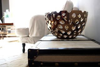
But it's the details of finishing the spaces that makes it more believable - the "I could live here" moments, and the portion of the project that I most enjoyed. Finding just the right accessories - lamp, crystal for the beverage cart, vase or blanket - is always a thrill of the hunt, and it's the touches of home we long for...that treasured piece.

I was delightfully pleased to see international retailer H&M bring it's Home accessories to Toronto, with the intent to transition the buyer to make accessories more fashionable and seasonal. Alongside with Zara Home, it's a great time to find that special something, perhaps of modern design, at affordable prices.