Monday, 7 November 2011

All things British

My recent trip to England had me whirling with my camera trying to capture all the wonderful architecture, fancy shops, street fashion and of course, interiors. Just thought I'd share some of what I saw, was inspired by, and what was just plain ole entertainment!...enjoy!
One of the many ceiling shots I snapped - awe inspiring detail and architecture.
 - taken inside King's College, Cambridge. 
Classic! Spotted at the Buckingham Palace souvenir shop.


A new addition to a century home we visited.
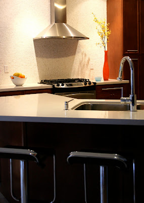
I love the classic modern choices.


Love this juxtoposition.
- taken at the Victoria & Albert Museum, cafe
My best discovery however was the National Trust store(s). I stumbled upon the store in Cambridge and just had to visit the London location as well. Chocked full of truly British wares at very reasonable prices, I couldn't resist walking away with two beautiful wool blankets, amongst other things. Their random wool blankets are a steal at £12 - they refer to them as 'rugs'. Luckily you can shop their stores online - and you'll be supporting a great cause.


My oh my - What imagination!
Yes, that's a person in a lizard suit riding a bike with a smaller lizard alongside.
- busking along the Thames.


Saturday, 1 October 2011

Charming wedding in the hills

It was a treat for me to be the coordinator for a friend's wedding about a month ago. After months of detail snippets via email - the couple resides in California - everything went off without a hitch! The ceremony was short, sweet, and entertaining; the rain held off for the wonderful Caribbean inspired cocktail reception out on the patio; and the couple was oh so cute.

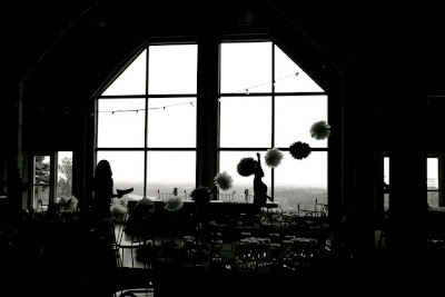
Here are some pictures taken a couple days before the wedding when we went to decorate and set-up.


The venue was picturesque Skyloft, in Uxbridge. The hilltop lodge, with its large back patio overlooks green meadows, forests, a few lakes and the city in the distance. As guests arrived, they were drawn to the patio by the lively and live Caribbean pan player, the aroma of home-made cocktail Jamaican patties, and well, the large boat of sushi didn't hurt either.

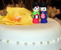
Throughout, the decor was simple and charming. Mostly everything was hand-made,  thoughtful and meaningful. Instead of table numbers, everyone found their 'animal', inspired by the couple's beloved pet dog, that couldn't make the flight from their California home. Also on the mantels of the two large fireplaces in the main hall were the couple's baby and family photos....awwww.

The home-made desserts and pizza, served just before midnight, were also a sweet treat!

Overall it was a wonderfully inspiring day!


My Best Wishes to Andrew and Soehra as they begin their journey of life together.

Sunday, 21 August 2011

A new take on Training!

Here's some of my earlier work for TELUS Communications. I wish I had taken some before shots, but instead dove right into the project since there were tight deadlines. The finished spaces are truly a transformation from the gloomy shades of dusty blues and grays that enveloped the rooms before. 


The scope of this project involved updating the interior of two rooms to better reflect the TELUS brand. The rooms, 690 sq.ft., consisted of a classroom and a training/multi-purpose room.

The project was carried out within a very challenging schedule. The two room facility is used several times a month to train customers and generate revenue, thus all renovations had to be done with little interruption to the training schedule. Where possible, existing furniture pieces were refaced and reused.

The final product provides more flexibility in using the space, while offering comfort and the fresh TELUS approach that customers expect of the brand.

Friday, 6 May 2011

Contemporary meets kid friendly


Great room AFTER
A young professional couple with small children wanted their home to reflect their contemporary style, with a touch of the eclectic to showcase their worldly travels.

Great room BEFORE
Consultation began at the planning stage of a builder’s model, so customizations to the layout were possible. Few finishes and upgrades were purchased through the home builder as they did not offer the quality or variety of finishes and products that were needed to fulfill the look desired


Keeping in mind all-around durability, safety and practicality for their young children, as well as the continual entertaining the family does, many custom pieces were designed for the 3200 sq.ft. home.


Adding energy and fun into the children’s rooms was easily done through paint and creative colour combinations. Creating a room for children to grow up with instead of theme-type spaces is the key to good design – and of course, it’s all in the details.


...And there's more!

I'm in the midst of putting the finishing touches on their basement renovation. It includes another feature fireplace, a workout area, children's playroom, guest bedroom, full bathroom and more! Watch out for more pictures in the coming weeks.


Monday, 25 April 2011

The Bull finally has a pen!

It's been a couple months since I was first approached by the entrepreneurs of a new financial and mortgage model, to design, decorate and project manage their inaugural office - a space that represents their fresh brand, portray pure professionalism, yet account to a very tight budget.


Thankfully the space, 1200 sq.ft, was basically a rectangular void. Looking past the peachy-dirt coloured ceilings, stucco treated walls, the multi-surface flooring and the leopard-striped wallpaper (can you imagine??!!) that plastered the tiny bathroom was the easy part. Fitting a generous reception area, spacious boardroom, three offices, a kitchenette and bullpen was the spatial challenge that made this project interesting.


Inspiration was taken from the draft website that I was privy to view. It was important to the clients to create a sense of continuity with the brand and website, so the office needed to reflect a modern sensibility with a nod to the familiar warmth of home. There's also a great image taken from their website to greet you as you come through the front door - reminiscent of a warm sunny day, every day!


The use of white is evident throughout the space, however every room has a balance of colour or texture to provide interest. Vibrancy is given to each room and space through the photography that was carefully chosen.


The company, Taurus Mortgage Capital, was created with a vision to help Canadians achieve successful home ownership in a non-stressful environment...that's fun, yet professional. I think we captured this vision to a "T"! 


“Michelle has a great ability to look at an empty canvas and see a project in its final form. Her vision led to an absolutely amazing design, which went far beyond what I had originally pictured. She pays attention to every detail, was responsive to our every request, and most importantly knows how to execute. Every day I come into our new office, I am proud of the work she did.” 

– G. Hugh, Taurus Mortgage Capital

The great clients!! - Corey Romyn and George Hugh