Friday, 10 July 2015

Wi-fi lounge

I'm always looking for new design challenges and love the freedom of re-designing a space with a fresh spin.

I was approached to turn a couple storage rooms in a residential building into creative and productive spaces for the residents (a large student population).
The main lounge stripped back
Whether composing an essay, drafting a proposal, or just browsing the internet, the space you work in has a huge impact on productivity. With that in mind, I tried to strike a balance with enlivening and tranquil, yet efficient spaces. Taking inspiration from local libraries, keeping the spaces uncluttered, well lit and implicitly motivating. I added subtle hints of color so as to not overwhelm the workers who would be using this space.
I transformed the two rooms into three spaces: a main lounge, a boardroom and a quiet room with study carols. In the lounge, the open casual sectional seating creates differing lounge or work areas while simultaneously accommodating both small and large groups, allowing users to freely discuss project ideas or spend some solo time catching up on readings.


The quiet study room has a great accent wall. The motif is an intuitive reminder to stay focused on the task at hand and gives a jolt of color in those moments when you need a creative stroke. 

I continued the same hue of blue into the boardroom, but placed it on the floor - it's that easy, when you use carpet tiles! The overall gray palette offers a soothing muted feel - orderly yet an unstuffy environment. 

 
I took a walk through the space a few months after completion and was pleased to see that the area had been completely embraced by the residents. All the rooms were being used! You could feel the concentration, prolificacy and gratitude for such an indispensable facility in the air. 

And now the only thing stopping me from using the space myself ... What's the wifi password? 

Friday, 1 May 2015

Mid-Century Modern


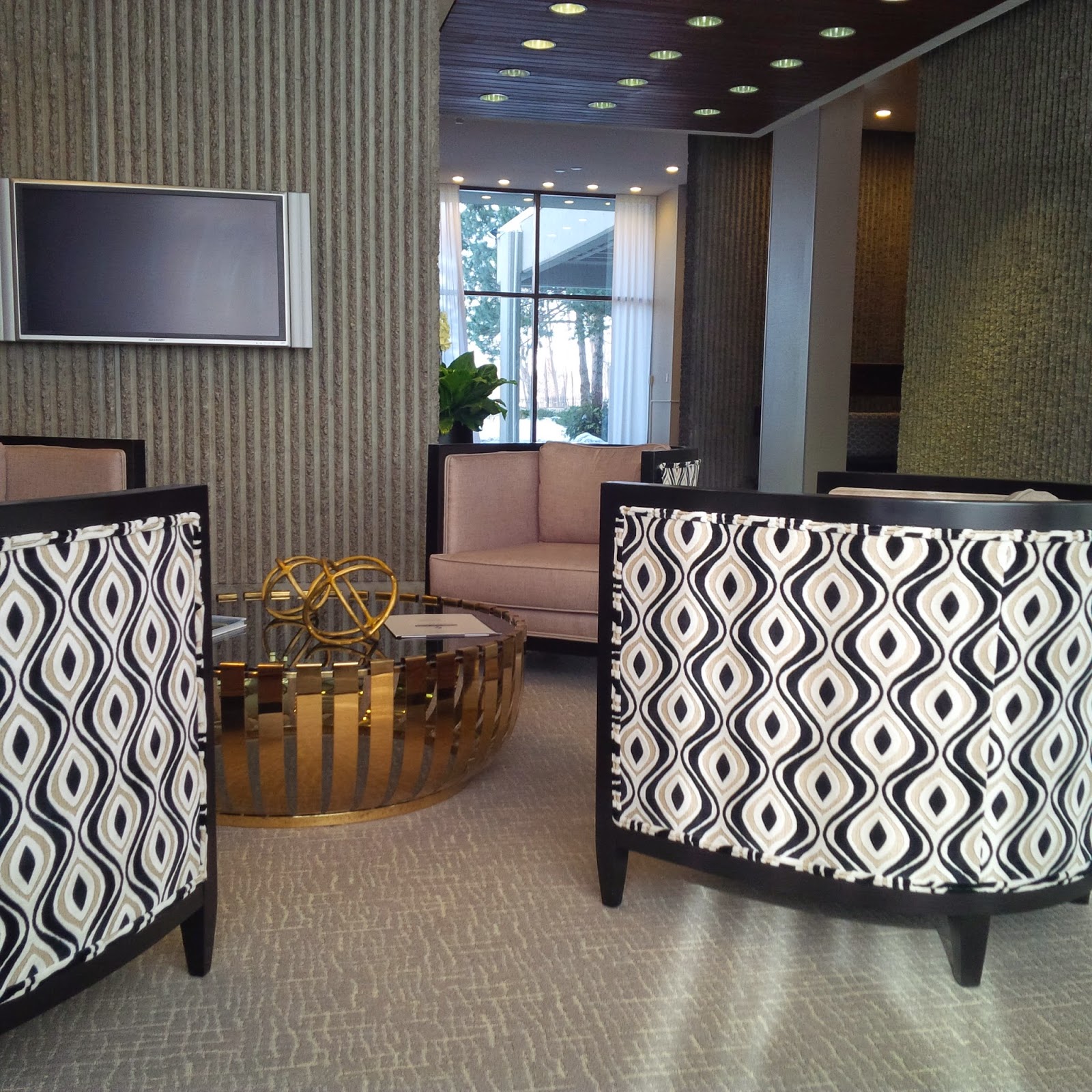
The lobbies of two luxury residential buildings built back in the days of the Rat Pack were in dire need of modern rejuvenation. Outdated and tired furnishings needed to be replaced with something with a little more "oomph". 

Before
There are four lobby areas - each with wonderful soaring ceilings, walls of windows and ample space. I liked the juxtaposition of the exposed concrete walls with the wood paneling so decided to keep the bones as is - however I gave the wood a new stain. 

The client requested I keep the furnishings neutral, so I used a soft palette of greys, taupes and blues. In such a large space, each piece needed to hold its own so I designed a signature sofa - the craftsmanship is incredible! - and infused flare to the occasional chairs by placing a pattern on the backs. Placing pattern on the outside of the chairs was the best way to include motif since the client did not want any loose accent pillows.

My aim was to make the furnishings soft and of equal weight to balance the space ...with a nod to what may be found in Frank Sinatra's living room. The glamorous, yet relaxed furnishings pay homage to the past while fusing together stylistic references both old and new. 

I added a much needed central chandelier, a gold Sputnik by Jonathan Adler, to give more presence to each lobby space. The large photography pieces mixed with the polished brass and velvets complete the feeling of grandeur. Sumptuous materials, respect for craftsmanship and attention to detail are key to recreating the elegance of the past. 

The space now feels wonderfully inviting, tranquil and luxurious. 
Cut velvet fabric on the back of the chairs are inviting to touch!


Tuesday, 28 April 2015

A boost of colour


"...trying to make the colors intense, and not a harmony of greys." - Vincent Van Gogh

Nothing says 'welcome Spring' more than yellows and blues! 

As much as I love colour I'm normally asked to keep palettes neutral and can only add hints of colour in accents. But then I came upon a fabulous carpet that beckoned to be used, in a bursting palette - hand in hand with a client that urged me to go wild with colour... It was the creative colour boost I longed for!


The assignment was to refresh a well used but forlorn lobby in Yorkville's premier senior's residence. I began by looking for fabrics worthy of sitting atop of the beautiful carpet that was to be. It needed to be classic but updated since the palette was bold and the pattern modern. I came upon this ideal Robert Allen Crypton fabric featuring an updated damask in a Citron colour on a field of Taupe. To give the space energy I paired it with its complimentary colour - a brilliant blue velvet, again from Robert Allen's contract line of fabrics - it's a stunning shade and feels so luxurious, you'd never know it was a contract fabric.

Residents regularly use the lobby as a waiting area three times a day as they await the opening of the dining room, so we needed to accommodate a lot of seating. There were also a few pockets off of the main lobby space that we tied into this scheme, to give the main floor a cohesive look.

I updated the fireplace by designing a modern surround and mantel and covered it in a wood similar to what was already in the lobby. The fireplace is now the focal point of the space, as it should have been... Some residents didn't even realize there was a fireplace prior!

I decided to place a custom glass art piece above the fireplace and had local artisans create pieces matching the colour palette. I gave them artistic freedom with the installment  - my only direction and inspiration was Chihuly's ruffles - and it came out beautifully! It's light and playful but sophisticated and bold. The space definitely needed some bright accents to reflect the radiance of the residents. 


And I'm still loving the flare of colours in the space! 

Friday, 6 March 2015

A quick refresh

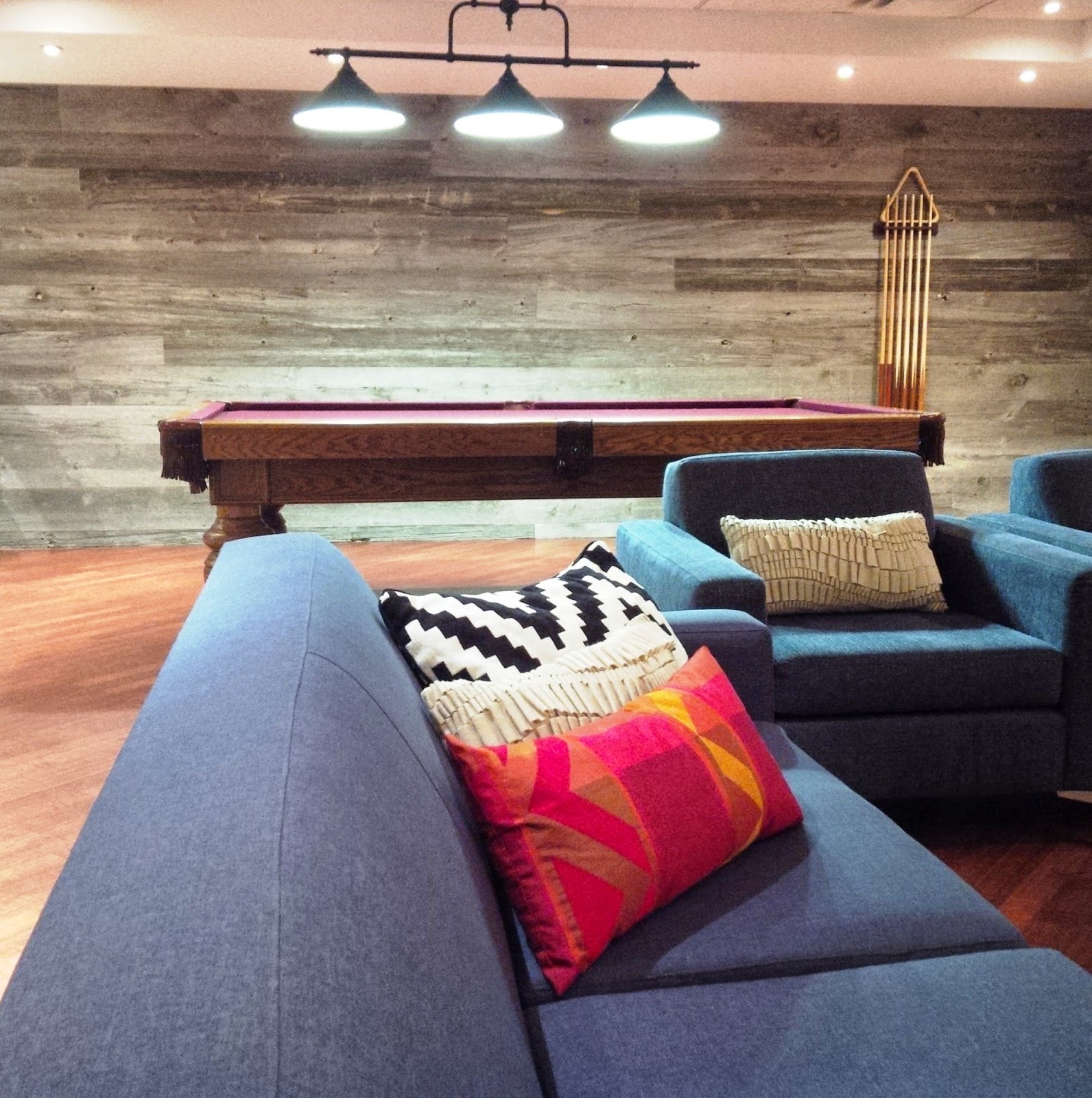
This social room needed a quick refresh on a limited budget. I immediately thought the room needed to be warmed up and injected with a sense of personality. It's located in a desired area of downtown Toronto and is a large building.

The long wall by the pool table had taken a beating from the poking cues so I addressed that area by installing reclaimed barn boards. From there small changes to light fixtures, furnishings and a large piece of black and white artwork (photography) gave the space the downtown vibe it needed.

We also changed out the kitchen and gave the bar area a small facial.

Now the space is a little bit funky and ready for a party.


Monday, 23 February 2015

Mad about Plaid

Before
Once again I tackled a space that was underutilized; the lounge adjacent to the laundry room, in the basement of a large mid-town building --dare I say it felt dungeon-ous?  --which residents would pay no heed to unless they wanted to borrow a book from the large library, or abandon a piece of their furniture.
 
So as kings and queens of this castle would've beckoned, I took my inspiration from a wonderful tweed plaid I've had in my back pocket for a year, itching to put it to use. Plaid and checks can crisply jazz up an outfit and can work in a room too to have the same effect - traditional with a youthful spirit.

I decided to place the inspiration fabric on two large ottomans, and began layering in more squares into the space. The carpet was a no-brainer -- I'm still in love with it! The custom wall unit was also an instant must-have for the room to maintain ample space for all of the books, and now we even have room for growth.


I convinced the clients that the castoff wing chairs were also salvageable. They were reupholstered with a modern twist of croc vinyl with linen backs and the wood got a update with black stain. I love how these transformed!


The space now reads like a modern English library: cozy and warm, surrounded by time worn books, a few heirloom chairs, and comfy velvet chesterfields to relax in.
The residents are loving the space and I'm still mad for plaid.


Monday, 8 December 2014

'Tis the Season to Decorate


The design business knows no breaks, not even for Christmas!

We've been busy all year working hard to get client's properties in top shape, so it would be wrong to ignore the Christmas tree that will be the crowning glory of the spaces, for the next month at least.

Given the task, I chose to make every tree unique - from classic to whimsical for children and adults - every tree has been well curated for the spaces.

I had elves help out with putting up the many thousands of ornaments on the tens of different trees for the lobby spaces. Rule of thumb - 100 lights per foot of tree, and to get a full look, estimate 40 ornaments per foot of tree, depending of course on how wide the tree is.


I decided to use the traditional ball ornaments as my base, however to garnish the trees, we added special accent ornaments that would catch the eye and tie in the colours of the balls. Kids trees were given more of a jolly flare, hung with decorative plushies and shimmering lollipops.


With now close to forty trees completed, tree trimming is a breeze, although the planning process is a little tedious it's all worthwhile in spreading the Christmas spirit.


Sunday, 12 October 2014

Room with a View


How do you begin with a room that's so... uninspiring?

Before - too many columns!
First of all, we had to take care of the bones of the space, which meant opening up walls and adding some architectural details. The room had a lot of potential, as there's a great view of the lake. Once we removed the columns, dated features and mounds of mirror, there was a blank slate to start over with something more up-to-date.

We created distinct spaces for lounging, dining, and cocktailing!  Added in some practical finishes such as durable vinyl plank flooring and a 15 ft long bench, again in vinyl, for lounging and easy clean ups.

I chose neutral colours for the basic finishes and furnishings to evoke a tranquil, almost zen theme, with small pops of colour sprinkled around in the accessories. The inspiration for this room was taken from this  Robert Allen flower print fabric - reflective of the lake, lush trees and flowers that can be seen out of the atrium in the summertime.
 
Before - kitchen
After - kitchen


Now it seems much more spacious and accommodating for a party - and it's just as beautiful as the view of the flora and fauna outside!